Helsinki Committee rebranded
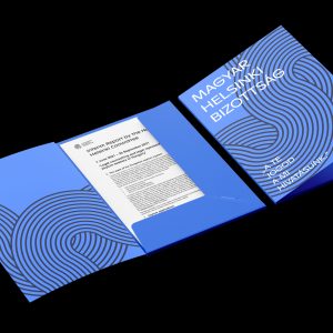
The Hungarian Helsinki Committee has a new logo now. The renewed logo builds on the previous one, but the new version is friendlier, cleaner, and more direct. With the help of the De-Form Design Studio, the organisation has revamped its entire brand, from letterhead to merchandising products.
Translation is available for this content
Váltás magyarraThe background and the challenge
Founded in 1989, the Hungarian Helsinki Committee is a human rights organisation that provides free legal assistance, including legal counselling and representation to people who become victims of arbitrariness by the state. It focuses on issues that belong to the sphere of inalienable universal human rights, still are the subject of intense public debate. The legal protection of detainees and refugees is a divisive issue in Hungarian society, and police abuse and the rule of law are also sensitive issues in Hungary. The Hungarian Helsinki Committee nevertheless stands by human rights values and stands up for its clients. It fights against injustice and arbitrariness not only with legal means, but also by using publicity. The human rights organisation is now presenting its new brand.
Renewal by preserving the roots
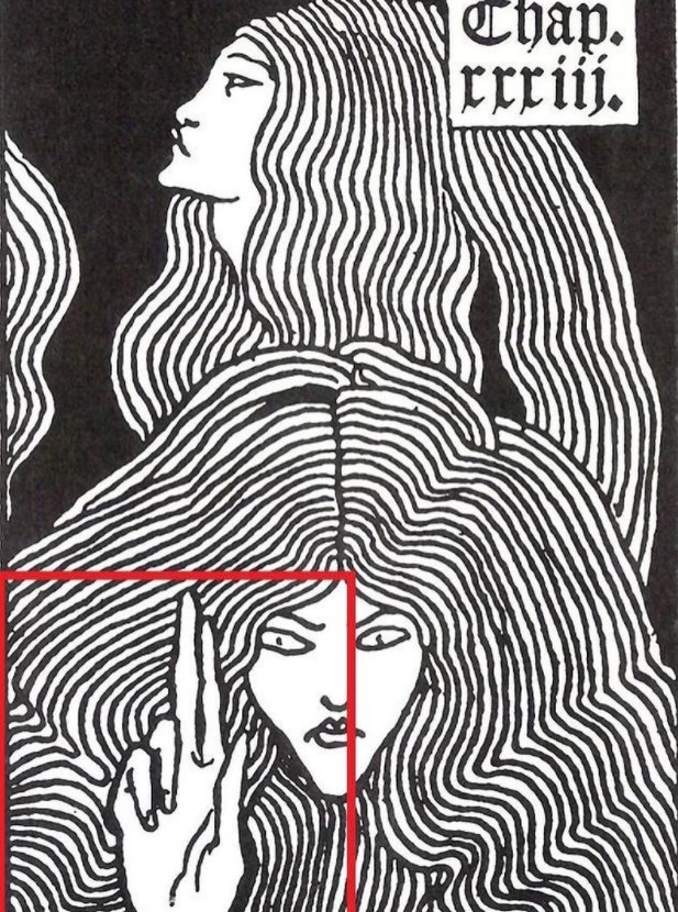
The central element of the rebranding was a remake of the “old-new” logo, the well-known Helsinki badge. The original logo is a cultural quote. The figure of a woman waving her fingers in the air is depicted in a woodcut by the renowned Art Nouveau book illustrator Aubrey Beardsley. The image was created for the 1893 edition of Thomas Malory’s medieval work The History of King Arthur and his Knights of the Round Table, medieval history of the Knights of the Round Table. It was the idea of József Pintér, the eminent book designer, 25 years ago that part of the picture should be the “coat of arms” of the Hungarian Helsinki Committee. The stern female face and the warning hand express the mission of the rights organisation: the vigilant guardian of fundamental rights.
Over time, the sternness of the original black and white engraving was softened with a yellow background, and eight years ago the mysterious lady’s hair was changed into rainbow colours. In addition to the solidarity with non-heterosexual minorities, this was a good illustration of how the organisation’s activities have expanded and become more colourful since 1989.

The youth has spoken
One of the new activities of the Hungarian Helsinki Committee is to bring the principles of human rights closer to young people, to make them tangible and understandable in their own language. Experience has shown that many young people have been perplexed or even dismissive of the ‘grumpy woman’, who they see as a caricature of human rights protection, who, according to some, ‘wilfully and grumpily puts everyone right, whether they like it or not’.
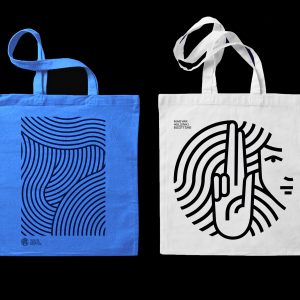
It is no secret that there has been a lively debate within the organisation as to whether the organisation’s logo should be changed, and if so, whether it should be a ‘facelift’ or a substantial change. There was no question that the new logo should also feature a strong woman. In the end, the organisation decided to work with the De-Form Design Studio to design the “new Helsinki Lady”, who became the niece of the previous one. Younger, kinder and more modern, she retained the facial features of her relatives and even her hand gestures.
A complete renewal
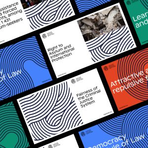
The logo is the centrepiece of a complete renewal of the Hungarian Helsinki Committee. The swirls of the Helsinki lady’s hair will appear on the organisation’s website, social media channels, stationery, and publications, on its banners and merchandise. And on the typography front, we have switched to a new typeface called Ginto, courtesy of abc’s DINAMO font designers.
It’s not just about renewing our visual content. The human rights organisation is also placing logos where it has not done so before. Sweatshirts, water bottles and pens will also bear the organisation’s logo, and the new branding will also be visible on our roll-up and booth when attending festivals and public events.
